Build BI dashboards
Rational BI is where you turn your data into business-intelligence dashboards: visual, shareable views that surface trends and answer questions at a glance. This guide takes you from an empty project to a dashboard that builds itself from a conversation, keeps its own data fresh, and can be laid out exactly how you want it.
Rational BI is a dedicated area for building business-intelligence (BI) dashboards on top of the data already in Rational AI. Your work is organized into projects — a project is the central workspace that holds a related set of dashboards, so you can keep, say, your sales reporting separate from your operations reporting. A project also holds reports: written summaries generated from one or more of its dashboards.
Open Rational BI
Select the BI tab in the top navigation. (You can also reach it from Settings → Rational BI.)
The first thing you see is your list of projects. If you haven't created any yet, this is an empty state inviting you to make your first one.
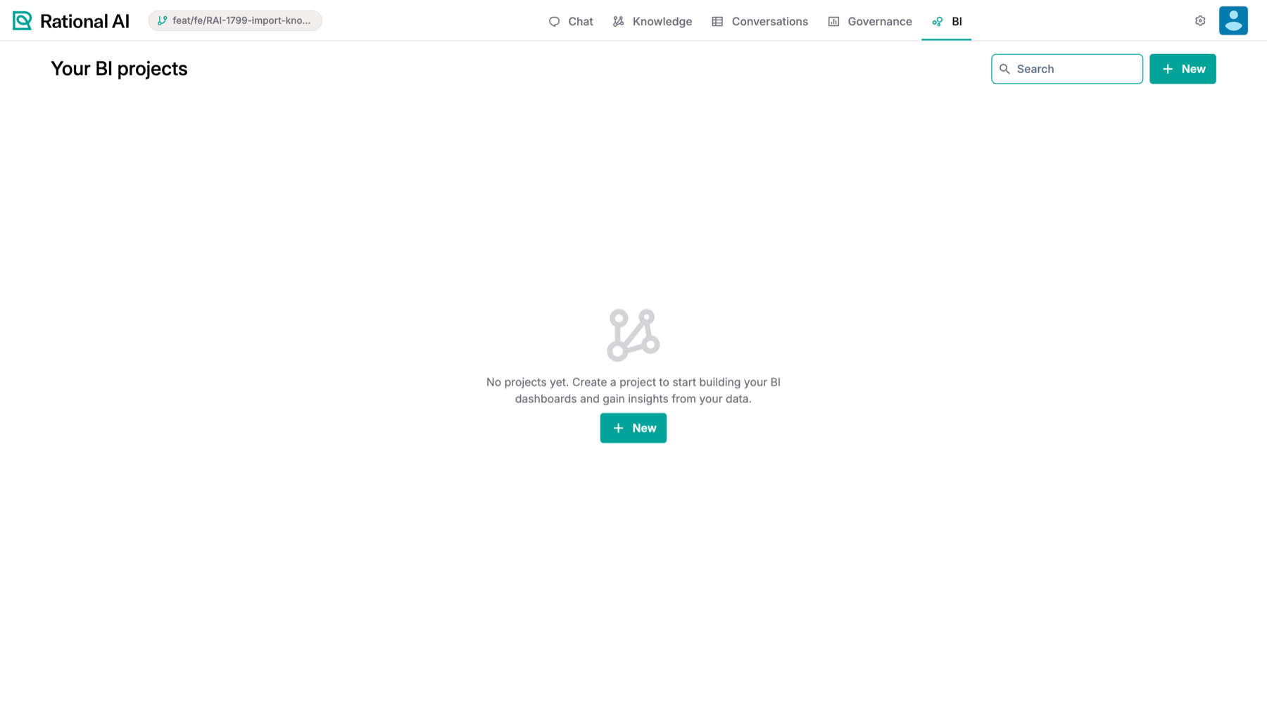
The BI area: your projects. Each project is the workspace for a set of dashboards.
Create a project
Everything in Rational BI lives inside a project, so the first step is to create one.
- From the BI area, select New.
- Give the project a clear name — something that describes the dashboards it will hold, for example
Sales Reporting.
Your new project appears in the list and opens as a workspace ready for you to start building.
Use a separate project for each distinct reporting area or audience. Keeping related dashboards together makes them easier to find and to manage as your reporting grows.
Give the project something to query
A dashboard can only chart data the project can reach, so point the project at its sources before you start building.
- Go to Settings → Rational BI and open the project.
- Open its Sources tab. Everything the project can query is listed in a single table, whether it came from a data source or from a Knowledge:
- Name, with the provider's own icon, so you can tell a cloud-storage source from a Knowledge at a glance.
- Description.
- Files — how many files that entry contributes.
- Use the Add… field below the table to attach another source or Knowledge; use the row's ⋮ menu to Delete one.
- Select Save.
The neighbouring tabs cover the rest of the project: Settings for its name and description, and Models for the models it uses when generating charts and reports.
Build a dashboard
Inside a project, Dashboards holds your dashboards and Reports holds the written summaries. Select New dashboard (or the + next to Recents in the sidebar) to start one. The dialog asks "How would you like to get started?":
- Generate with AI: describe the dashboard and Rational AI builds the charts, metrics and layout for you. This is the usual way to start.
- Build manually: start from an empty canvas, ask the AI chat for one chart at a time and arrange them yourself.
Generate it with AI
- Select Generate with AI, then Next.
- Describe the dashboard you want in plain language: what it should track, which trends and comparisons to show, and how to lay it out. The box starts from your project's own instructions when it has some.
- Select Generate. The new dashboard opens, named after your description, and the canvas shows "Rational AI is building your dashboard…" while the charts appear.
- If Rational AI needs more information, it says so on the canvas. Reply in Chat to let it continue. If generation fails, select Retry.
Once the dashboard exists, open Chat on it whenever you want to add or change charts.
Generated charts are saved to the dashboard as they are produced, so navigating away or reloading mid-generation does not lose them. If any chart does end up in the chat without reaching the canvas, a banner on the dashboard says how many are outstanding, with Add all to place them and Dismiss to ignore them.
Lay it out by hand
Select Actions → Edit to rearrange a dashboard. In edit mode you can drag widgets around the grid, resize them from the corner grip, and add structure from the settings sidebar's Sections tab:
- Title — a heading, at level Heading 1 to Heading 4, so a long dashboard reads as sections rather than a wall of charts.
- Free text — a paragraph of explanation next to the numbers.
- KPI card — one headline number with its label. It is backed by a query, so it refreshes like a chart.
- Graphs — a chart.
- Tables — the data behind one of the dashboard's charts, shown as a table. Pick the chart from the list.
- Divider — a horizontal rule.
- Spacer — empty space between blocks. In edit mode, set its minimum height in pixels.
The sidebar's Settings tab holds what applies to the whole dashboard, including Global colors and Delete dashboard. Select Save to keep your changes, or Cancel to drop them.
Tune a single chart
Select a chart to open Chart settings in the sidebar:
- Chart type — bar, line, area, scatter, pie, donut, radar, or Geographic map.
- Data source, SQL Query and Available tables — what the chart queries.
- Colors and Legend position.
- Advanced (Spec) — the underlying chart specification, when you want to hand-tune something the controls don't expose.
- Remove chart — take this widget off the dashboard.
A Geographic map colours each region by its value. Two maps are available today: US states and Italian regions. You don't upload any map files: Rational AI looks at the chart's categories and picks the map whose names they match, so a column of US state names or Italian region names is all it needs. Capitalisation and extra spaces don't matter. You can also ask for a map in the chat, for example "sales by region on a map of Italy".
Keep a dashboard up to date
A saved dashboard shows the data captured when its charts were generated. To keep an open dashboard current, give it a refresh interval.
- Open the dashboard and select Actions → Auto-refresh. The menu item shows the current setting.
- Choose an interval:
- Off — refresh manually (the default).
- Every 30 seconds
- Every minute
- Every 5 minutes
- Every 15 minutes
While the dashboard is open, Rational AI re-runs each widget's saved query on that interval and patches the results in place.
Auto-refresh re-runs the query the chart already has. No model is involved, so it is deterministic and cheap: the same chart, newer numbers. Asking the AI for a different chart is a separate, deliberate action in the chat. Background refreshes are also silent — if one fails, the dashboard keeps showing the last good data rather than interrupting whoever is looking at it.
The rest of the Actions menu holds Edit, Auto layout, Download (as PDF, CSV or a static Tableau snapshot) and Delete.
Auto layout tidies the grid: it moves every widget up as far as it fits, closing the empty gaps left after moving or removing widgets, and saves the result. Widget sizes stay the same.
Write a report from your dashboards
A dashboard answers "what do the numbers look like"; a report answers "what should we take from them".
- In the project, open Reports and select Generate with AI.
- Select one or more dashboards and describe what you want the report to cover.
- Once it exists, open the report and use Chat to work on it conversationally — ask for a different emphasis, a shorter summary, an added section.
- The report's Actions menu holds Edit, Duplicate, Download, and Delete.
Show a dashboard inside a Knowledge
A dashboard doesn't have to stay in the BI area. It can be rendered inside a Knowledge as a custom view, so the people working with the documents see the numbers next to them — with the dashboard's own auto-refresh interval respected.
Result
You have a Rational BI project pointed at its sources and Knowledges, dashboards you can either generate from a conversation or lay out by hand with headings, text, and dividers, charts tuned down to their type, colours, and basemap, an auto-refresh interval that keeps an open dashboard current without regenerating anything, and reports that turn those dashboards into something you can send to somebody.